iOS 7: The Good, The Bad, and the Ugly (Icons)
19 Sep 2013 · by bathompso · in Technology
After resisting the urge to upgrade to any iOS 7 beta, I finally installed it on my iPad yesterday, along with the rest of the world. Here are some first impressions of what Apple did right, and what needs to be changed in 7.1 and beyond.
The Good
iOS 7 finally plays to iOS’s strengths. As Apple has learned, design can be copied (and copied well) by Android vendors, leading to knockoffs that tarnish Apple’s brand and hurt sales. Instead of simply upping the visual ante with iOS 7, they exploited Android’s biggest weakness: animations.
Even 6 years into the smartphone game, I can’t read an Android device review without seeing some mention of “stutter” while scrolling or during other animation sequences. Even with quad-core CPUs and 9-core GPUs, Android just cannot get those transitions buttery smooth the way iOS has always been.
iOS 7 is all about animations: zooming into folders, zooming out of apps to the homescreen. These are all animations that look amazing (even on 3 year old iPhone 4S hardware), but will be utterly impossible to copy on Android. While visuals may look the same, the “fun” of the interface will be lacking.
iOS 7 also gets a plus for running awesome on old hardware. I don’t have an iPhone 4 to test, but Chrissy’s iPhone 4S runs it like a champ, maybe even faster than iOS 6. Suck it, Android fragmentation.
The Bad
Much of iOS 7′s interface will grow on me, of that I am sure. Many who have used all the betas have said it takes 2 weeks to a month for your brain to transition to the smaller menu icons, gigantic dock, and the new design of notification center. While I would count those as bad things right now, I know they will come off the list after I’ve become used to them. One legitimate bad thing about the iOS 7 update is the “nerfing” of multitouch gestures on the iPad.
A four finger swipe up opens multitasking. This gesture made sense in iOS 6 because the app would respond to your push: it would “lift up” and reveal the multitasking tray. Now, when you push up (and expect the iPad to respond to that force), it shrinks the app, and jumps to the right (the last opened app). In so many other aspects of iOS 7, it feels as if the interface is reacting to your inputs directly. Look at the notification center: when you slowly pull it down, it has a small bounce when it reaches the bottom. Whip your finger down as fast as you can with notification center, and it bounces back quite a bit. The interface elements are supposed to react directly to your input, but when it comes to multitasking it doesn’t feel like it.
The other multitasking gesture which has gone haywire with the iOS 7 update is the four finger pinch to close an app. Try it, and you’ll see what I mean. It looks stuttery and “off.” The reason is that when you close an app with the home button, all the icons zoom back in as a coherent grid. When you close it with 4 fingers, the icons fall in individually, like when you unlock the device. And with the 4 finger gesture, the timing is off. Additionally, when you use the gesture on apps like Safari, the background isn’t even the right one! It seems like somebody forgot about these gestures…
Regardless, it seems as though Apple wants you to always use the home button and never just the screen. Either that or they just haven’t had enough time to work on the iPad version (which got a late beta), and that all these problems will be fixed when they release the iPad 5.
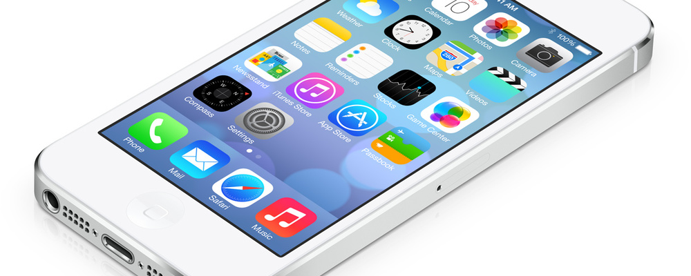
God, Those Icons…
I don’t think I’ll even get used to those. They need to go. Maybe they’ll look better when all the other apps on here are iOS 7-updated…